For this project I need to design 2 pieces that look like they have come straight out of creative review, which is a graphic design magazine, the first is a front cover and the second is a 2 page spread, these are both going to be design around the subculture that I have Chosen “Hip Hop”, the way I see myself learning about how “Creative Review” looks and works is by looking at past front covers and past 2 page spreads. Now because this is “Going to be for a design magazine” everything must be perfect, the images, the layouts, the colours, the type, everything…

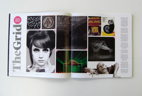
This is a 2 page spread from a recent “Creative Review” this type of magazine is aimed at professionals and people interested in the Creative Industry. This layout is very unconventional as it is in fact a contents page, it uses images arranged in different size quadrilaterals to direct people to the appropriate pages, this design is overall simple but because of the layout and different images it makes it look allot busier than it actually is.
Even though this layout has been used for a contents page I think it could work very well for a 2 page spread on a subculture, the image could almost show “a day in the life?” of someone involved in the “Hip Hop Subculture”, but after I have collected some research I will begin looking at some idea’s for the front cover and the 2 page spread.

This is another 2 page spread from a previous “Creative Review” and I am really liking the compassion of these 2 page spreads in this magazine, I think this is because of the various sized images and because I am a visual person I prefer clean and image orientated design and a design like this really makes me want to design my own based around my subculture. I prefer this layout more than the previous one simply because it’s more clean, this is because the images are layed out and sized better I think and the is a uniform border around the images and text, But I still want to look and test the other design because It could suit my subculture better but I defiantly want my 2 page spread to be image based.

As before here’s another layout, now this one has no borders which does work with some designs but I feel with this design it doesn’t, I think that it needs something, some negative space, even a small border would do it but to be honest I don’t know what the article is about so I cannot judge but for my it doesn’t look very though out.

For my own “Creative Review” 2 page spread I really want it to be primarily imaged based and this is a good layout to show off some images along with a decent amount of supporting text, A very large high quality image will add so much visual information the viewer will have choice but to look and a good designer will use an image than isn’t 100% explainable thorough itself a small piece of supporting text could push someone to read the whole article which is the whole point of a magazine for people to read the information and stories that are inside.


