1) Visual Communication
Basically the brief asks me to create CD packaging for a specific genre or album, I decide to go for Hip-Hop as the genre and Jay-z and Kanye West’s Watch the Throne for the album, I decided upon this because I feel that I could get the best results because I am most interested in this genre of music and I believe that I know what the target audience for this album would be. The brief wanted me to create CD packaging, now who this was gone about or created was up to me, the processes and overall finished product where up to me.
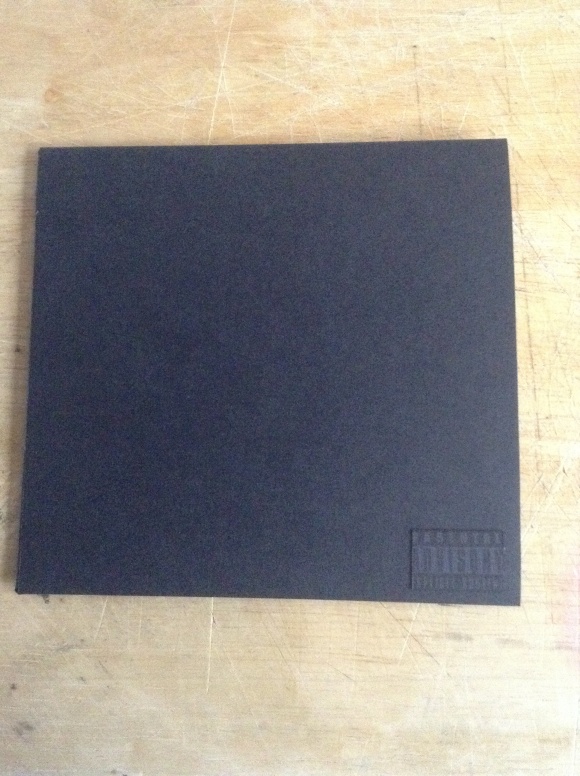
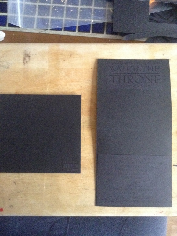
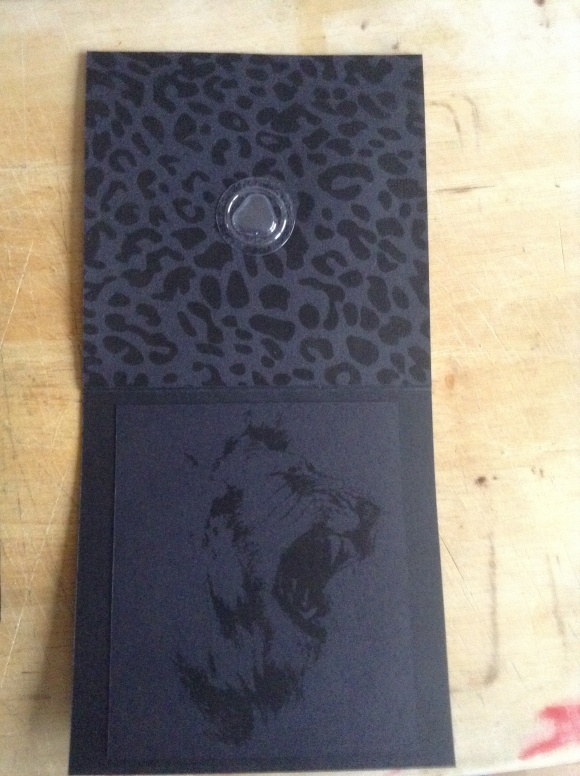
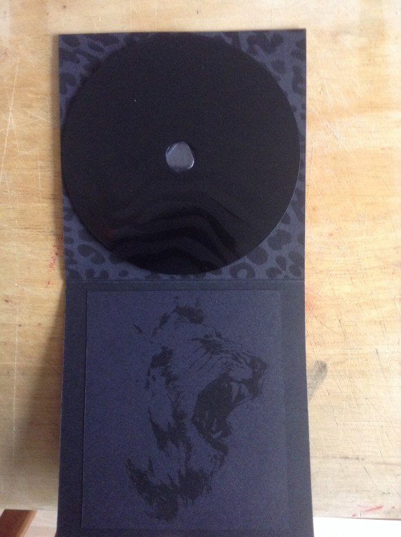
As a whole with the CD the packaging is very subtle and plain but on closer inspection it’s got all the information that is required and it just looks so different from every other CD packaging that I have seen out there, I think that the fact that the whole design is black makes it really bold and powerful but I also know that because there is only 1 shade of colour that not everyone will like this and I decided to take the risk and do t my way, I have got some reviews from people in my class and teachers and they all seem to really like the fact it’s just 1 colour maybe this is because it’s not often done but I really like it.
I’m not going to lie the smaller type is a little hard to read and this may allow for the piece to be mis-read or mis-understood along with the colour scheme but for a design to be successful and remember able there has to be something different about it…
With more time and money I would have really like to of made a 10 piece production of the design on some very high quality card, this would make the whole design pop and look the part, the finish at the moment isn’t bad but I would have still liked it to of been better.
2) Reflection of own working practices:
Be very honest with yourself in this section. Please feel free to approach a member of staff for help finding ways to develop skills.
My time keeping on this project was really good! I knew what I had to and got it done, I was really motivated on this project, I really enjoyed making this CD case but I think that this was because it was designing around something that I like and enjoy, My analysis of this brief was very good as I wrote I knew what In needed to do and set ahead and done it with plenty of time to spare.
My research was very good, I straight away began researching other CD cases in this genre and this really helped me to know about it all and how other’s designed for this type of music, My research allowed me to think out of the box relating the name of the album to the animal kingdom, this was a great step of my design process because it allowed me to get everything I needed for the design to relate and function as one. My own personal evaluations allowed me to draw conclusions and steps in my design, after starting by first using the gold leaf I decided that the design would look better without it but this process step allowed me to test and experiment something that I have wanted to use for a while “gold leaf”.
I really enjoyed this project this time around, I really liked the fact that I was able to design for something that I like and this genre of music is something that I really enjoy listening to and knowing about, I also enjoyed the fact that I was able to experiment with other things that I haven’t used before like gold leaf and cutting card to create the CD packaging, one thing that I didn’t enjoy was the fact that I had to write down on my blog all of the processes after doing them and this was tedious and annoying because I don’t like typing or writing haha.
The final design:


