Category Archives: Music Genre CD Design

Evaluation and Reflection:

1) Visual Communication

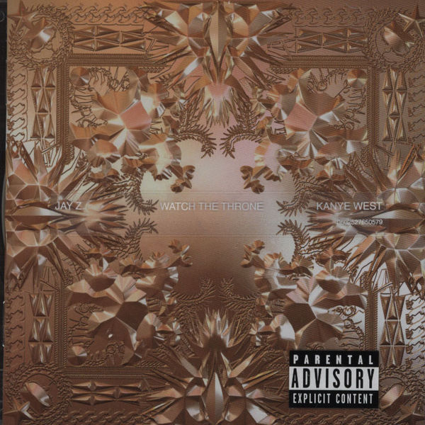
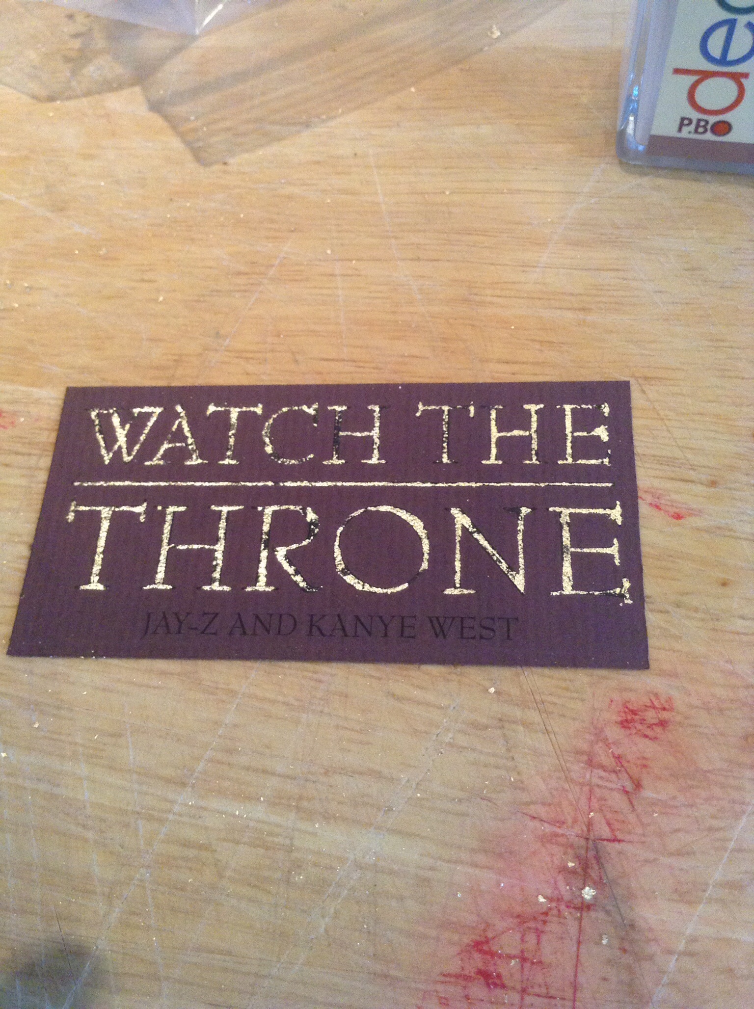
Basically the brief asks me to create CD packaging for a specific genre or album, I decide to go for Hip-Hop as the genre and Jay-z and Kanye West’s Watch the Throne for the album, I decided upon this because I feel that I could get the best results because I am most interested in this genre of music and I believe that I know what the target audience for this album would be. The brief wanted me to create CD packaging, now who this was gone about or created was up to me, the processes and overall finished product where up to me.

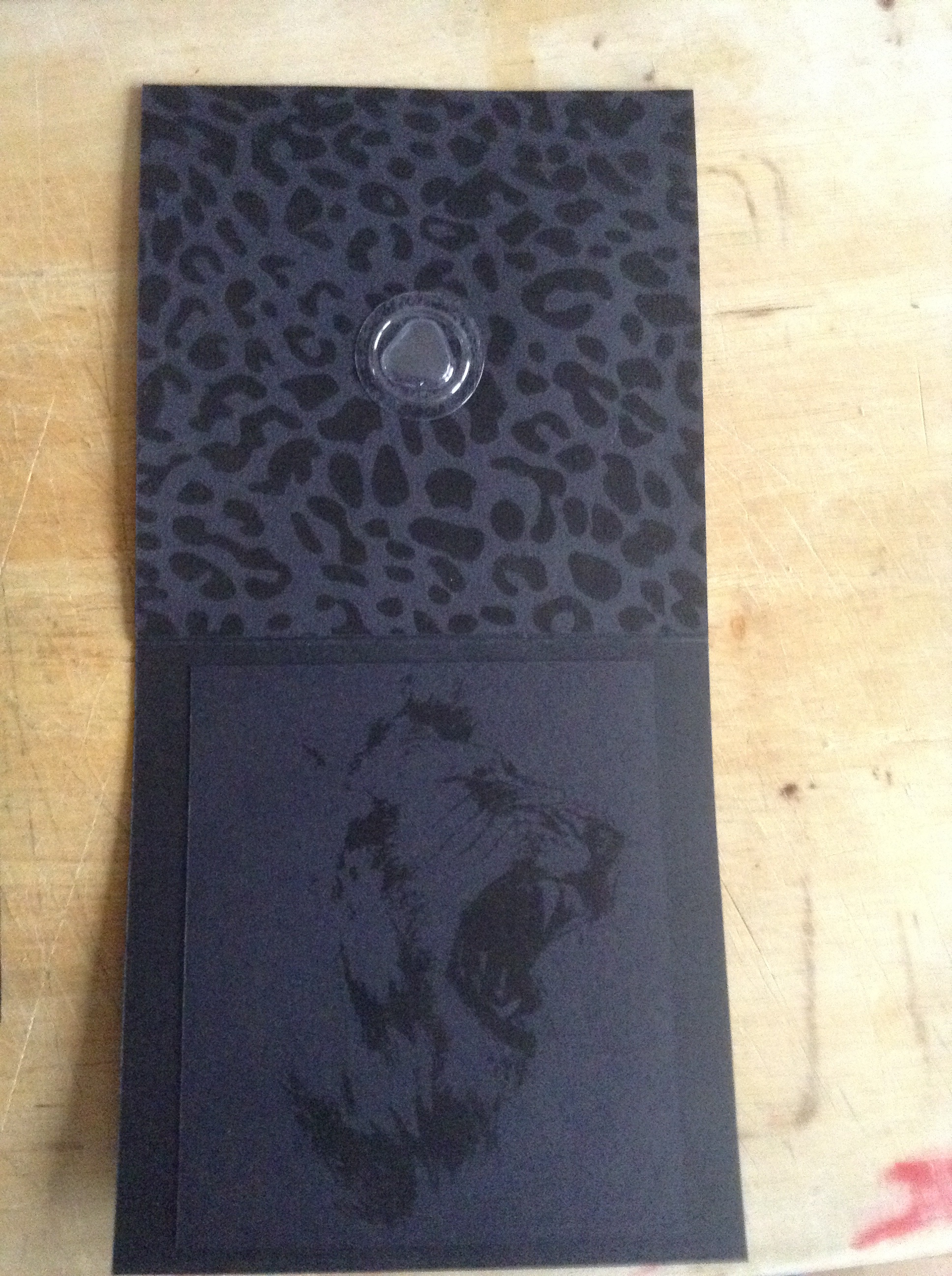
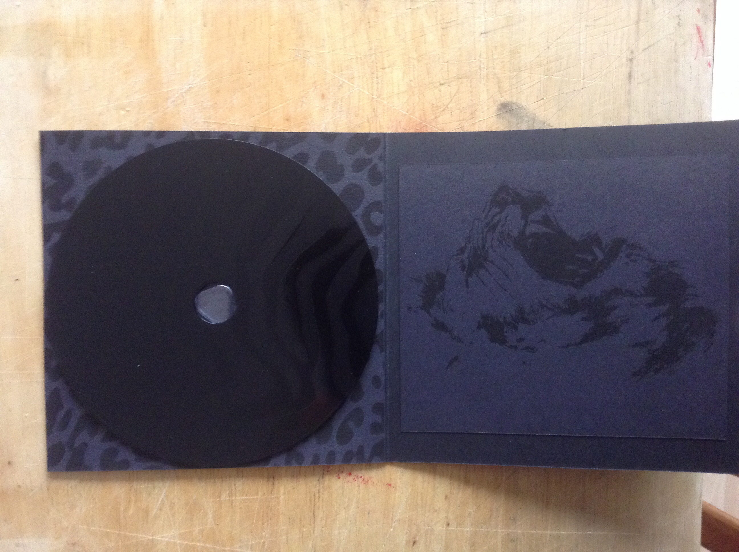
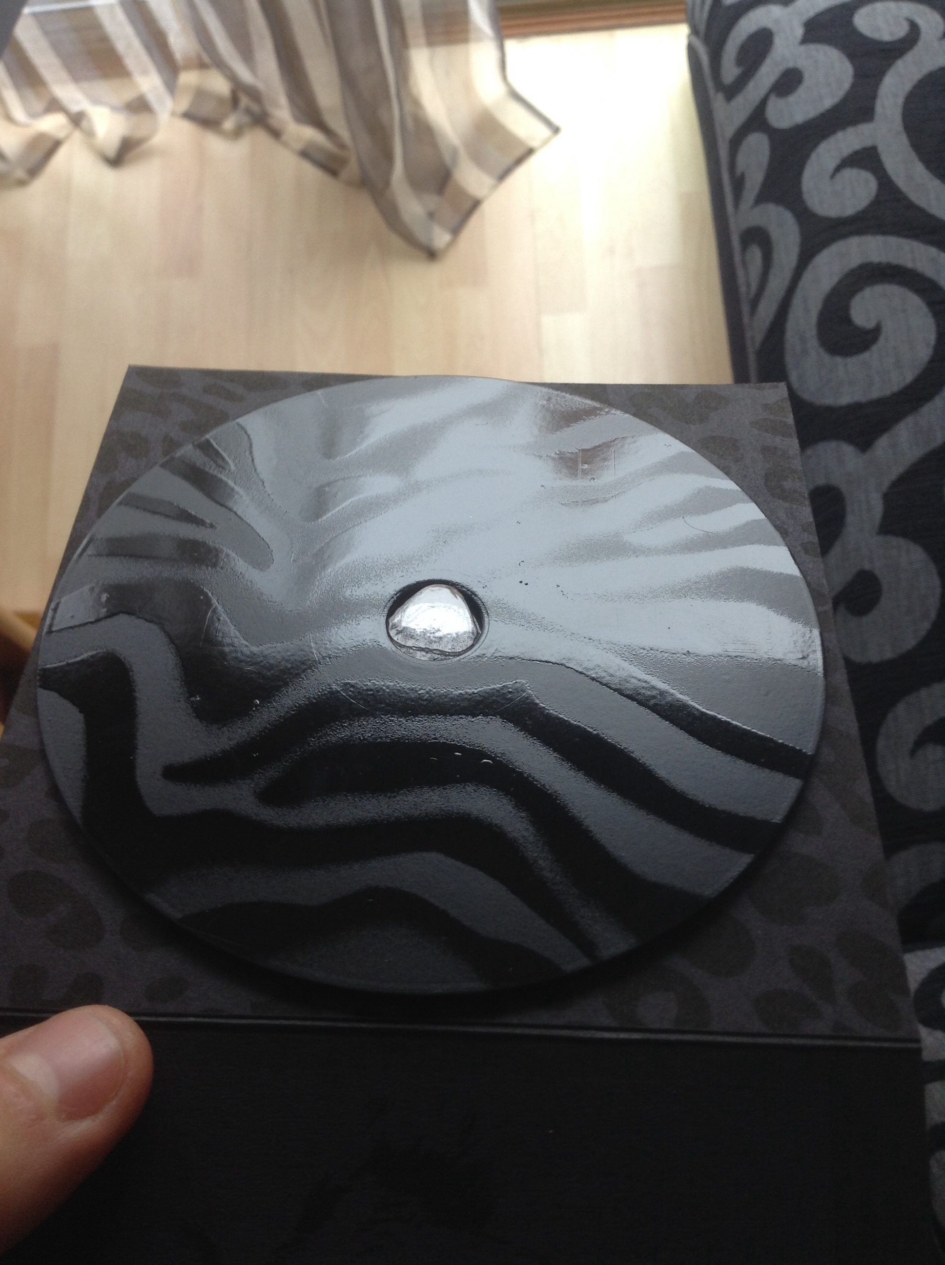
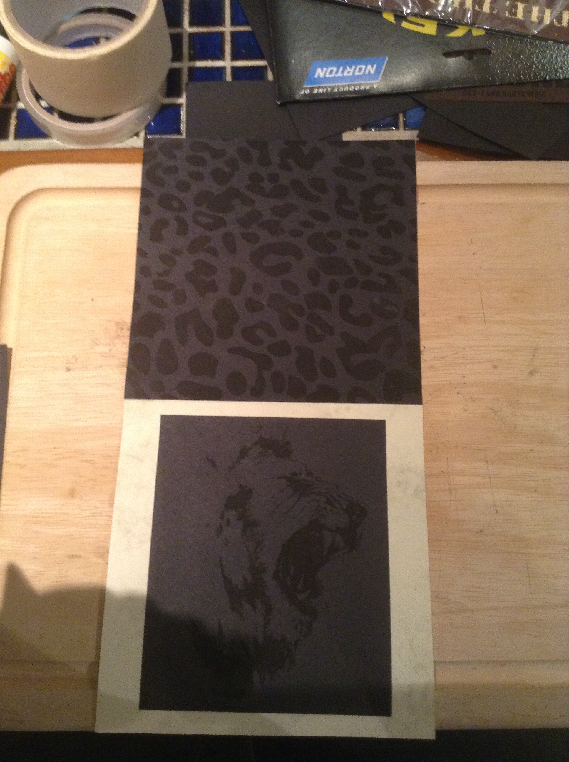
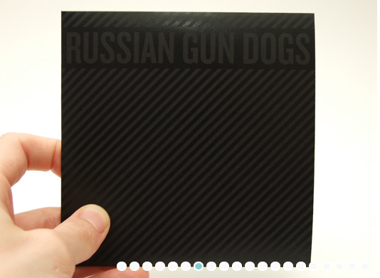
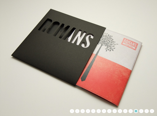
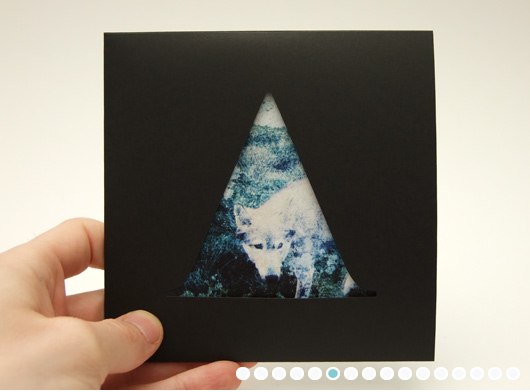
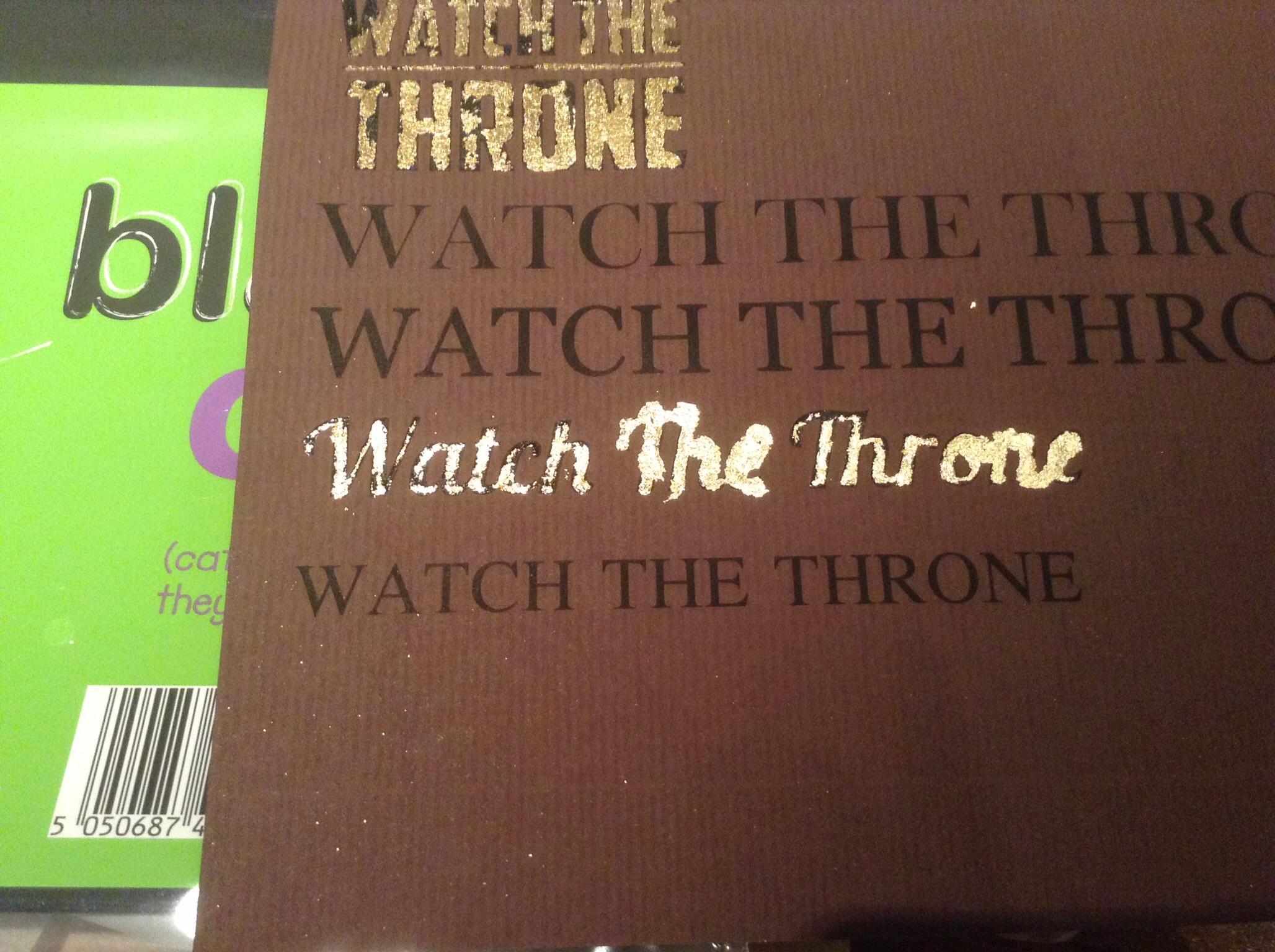
As a whole with the CD the packaging is very subtle and plain but on closer inspection it’s got all the information that is required and it just looks so different from every other CD packaging that I have seen out there, I think that the fact that the whole design is black makes it really bold and powerful but I also know that because there is only 1 shade of colour that not everyone will like this and I decided to take the risk and do t my way, I have got some reviews from people in my class and teachers and they all seem to really like the fact it’s just 1 colour maybe this is because it’s not often done but I really like it.

I’m not going to lie the smaller type is a little hard to read and this may allow for the piece to be mis-read or mis-understood along with the colour scheme but for a design to be successful and remember able there has to be something different about it…

With more time and money I would have really like to of made a 10 piece production of the design on some very high quality card, this would make the whole design pop and look the part, the finish at the moment isn’t bad but I would have still liked it to of been better.

2) Reflection of own working practices:

Be very honest with yourself in this section. Please feel free to approach a member of staff for help finding ways to develop skills.

My time keeping on this project was really good! I knew what I had to and got it done, I was really motivated on this project, I really enjoyed making this CD case but I think that this was because it was designing around something that I like and enjoy, My analysis of this brief was very good as I wrote I knew what In needed to do and set ahead and done it with plenty of time to spare.

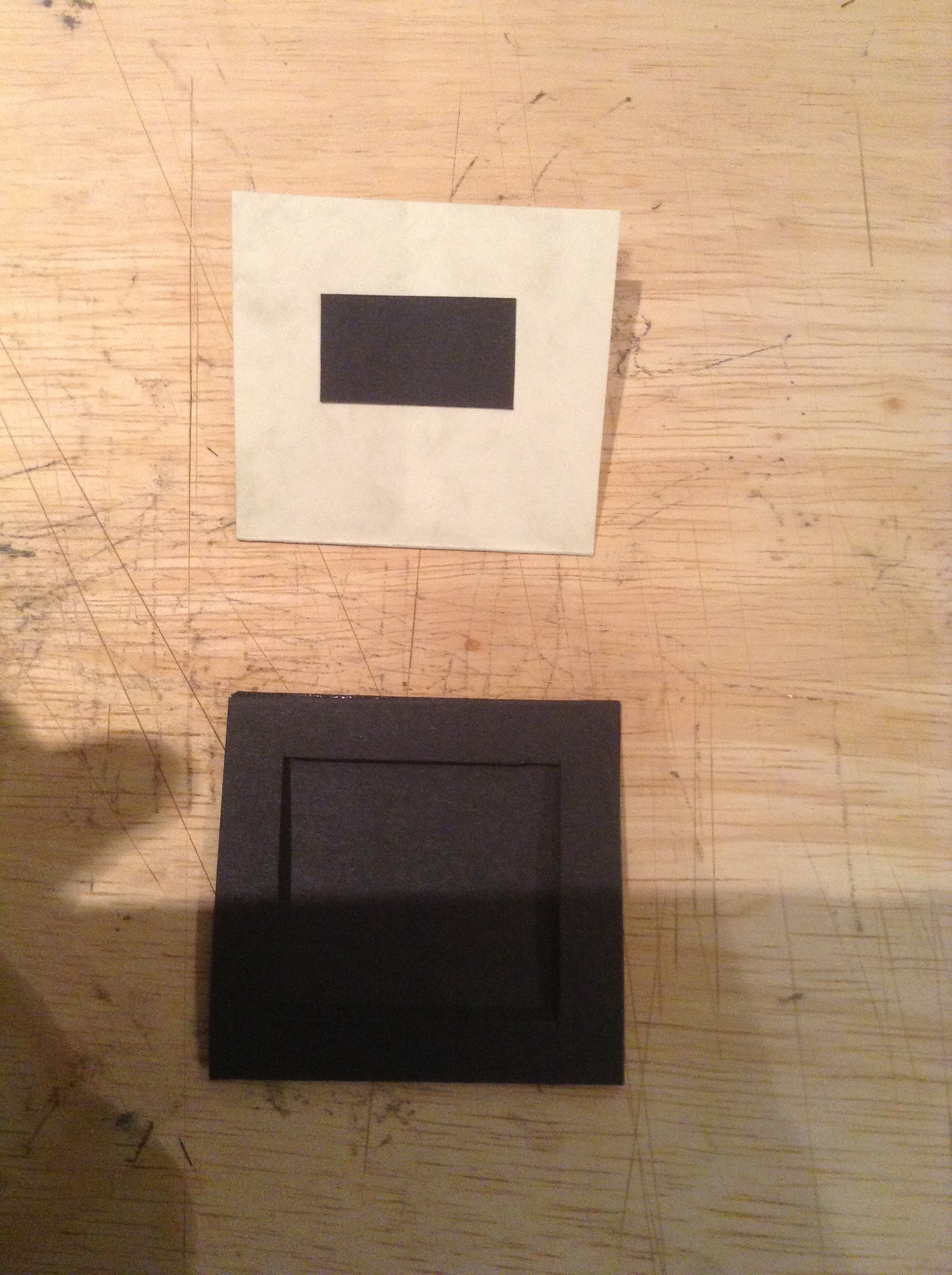
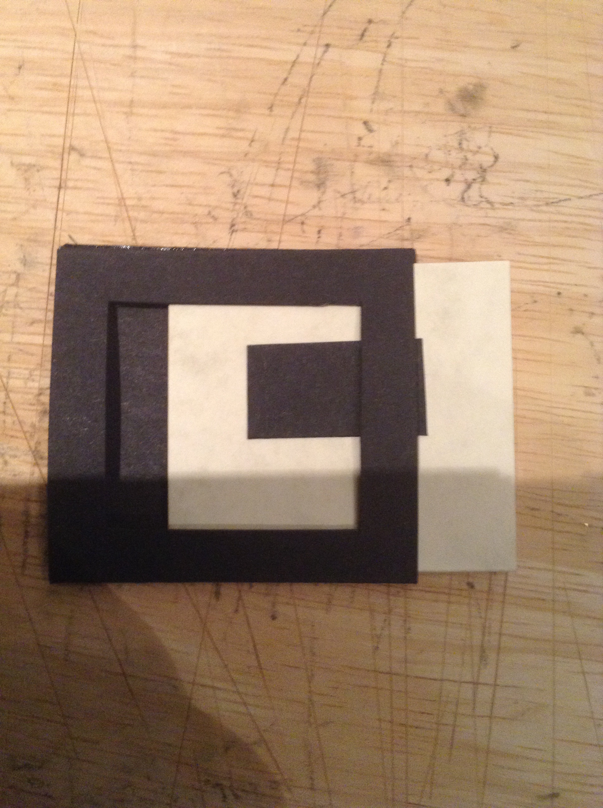
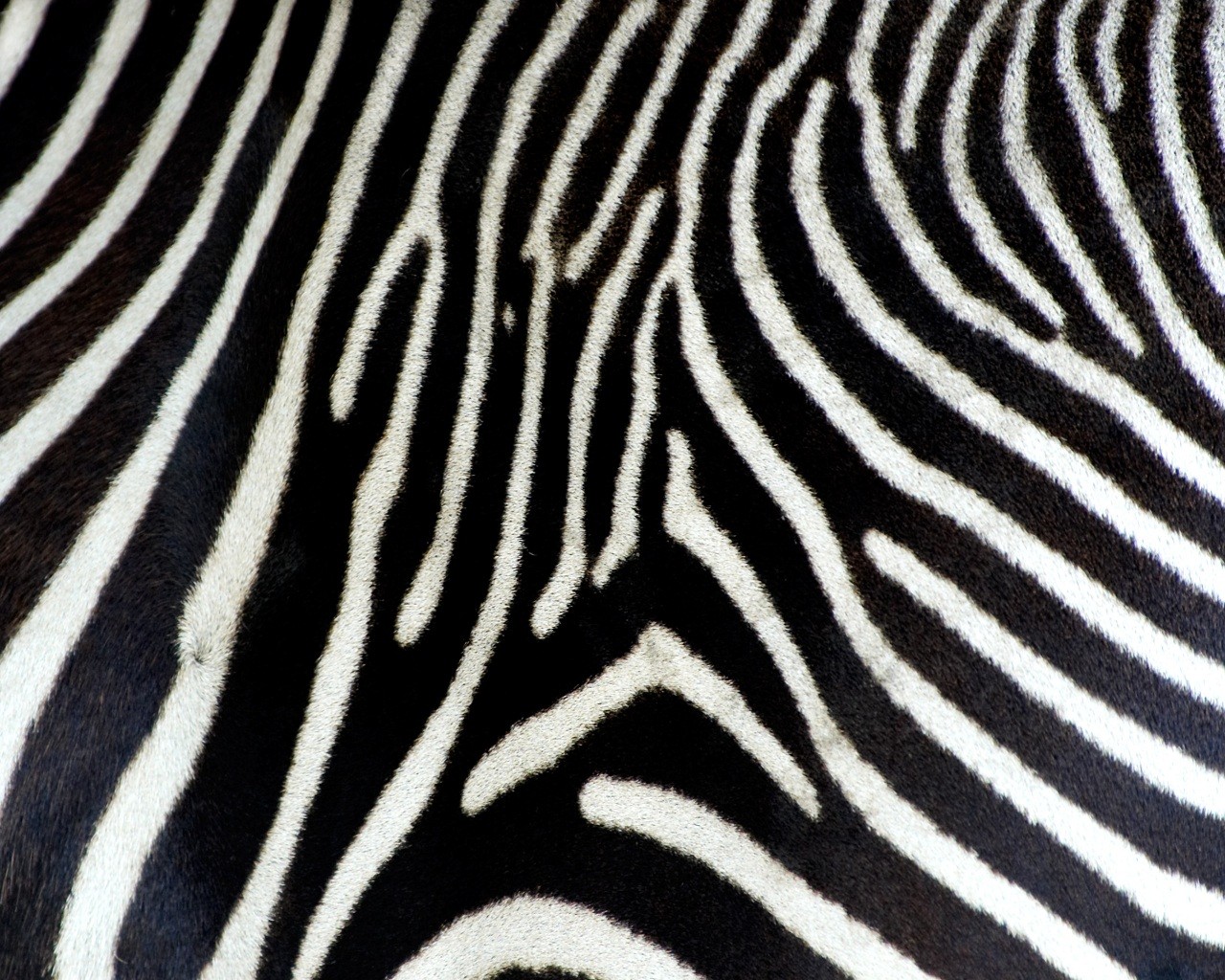
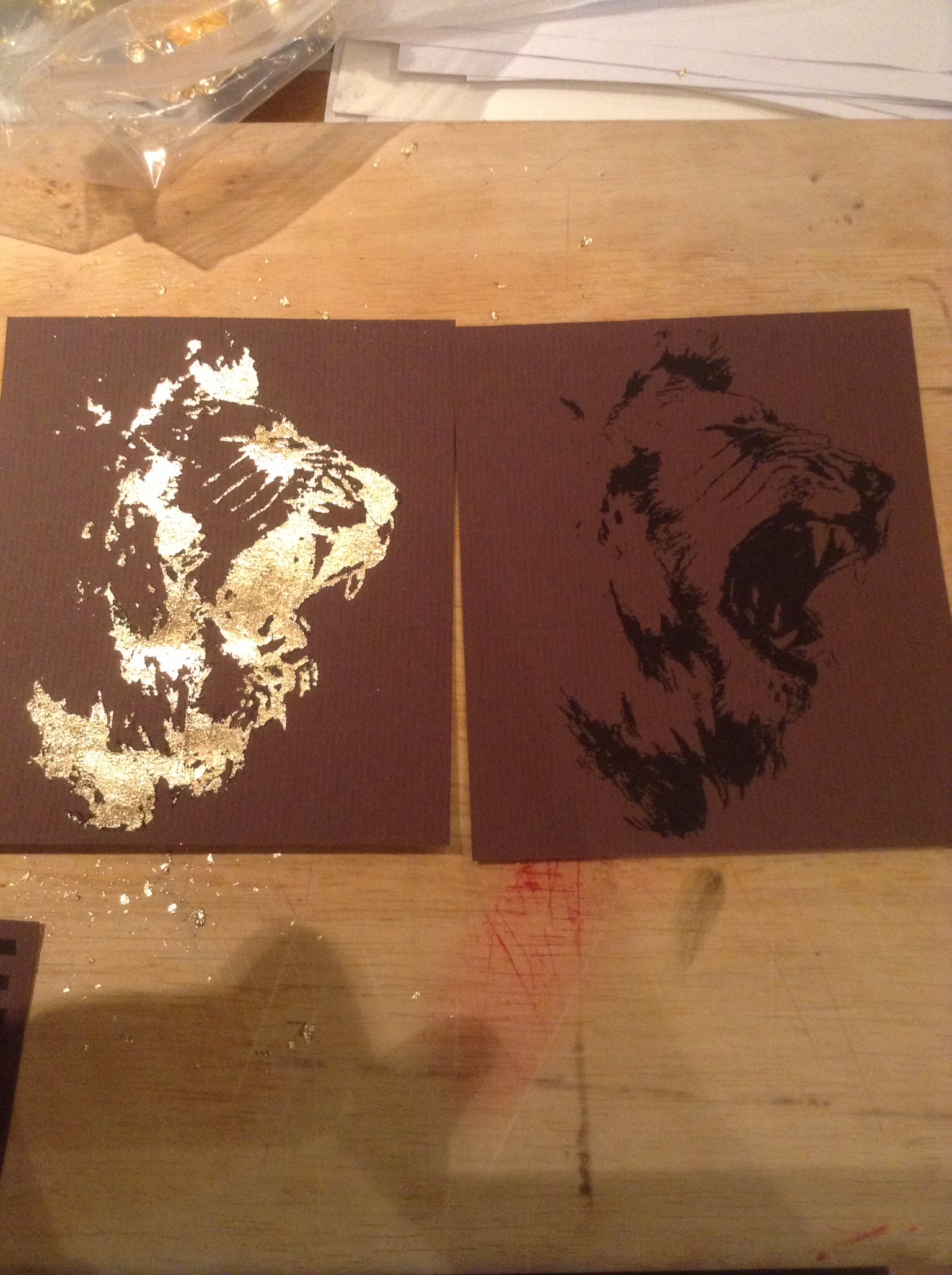
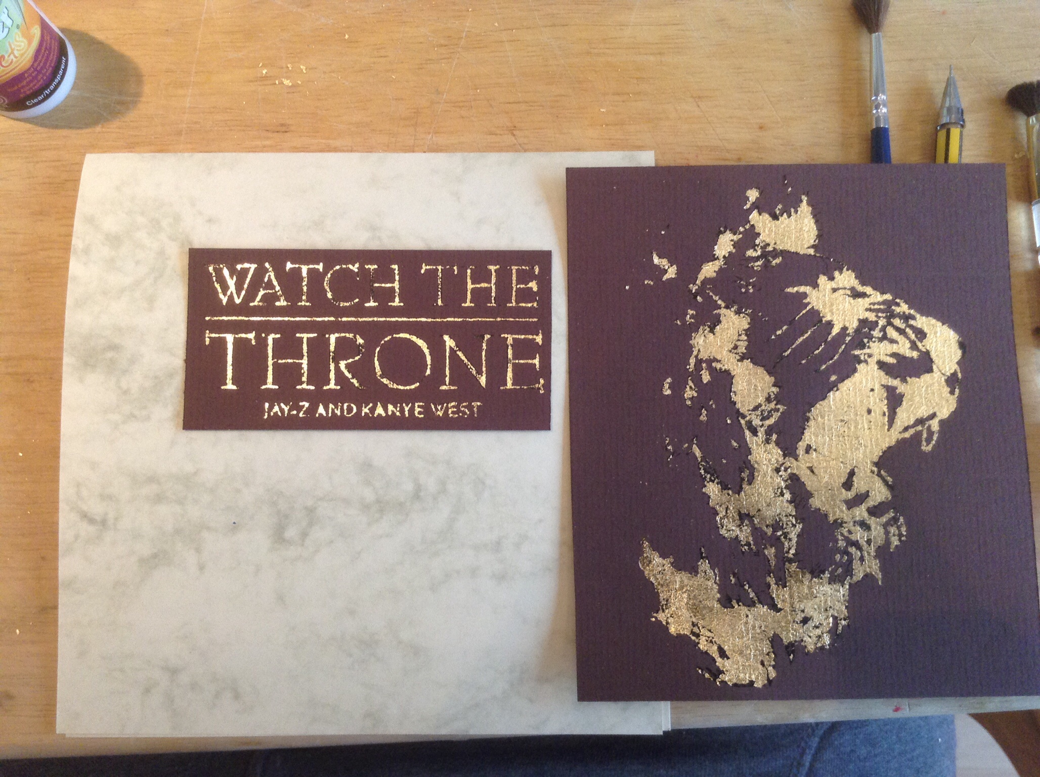
My research was very good, I straight away began researching other CD cases in this genre and this really helped me to know about it all and how other’s designed for this type of music, My research allowed me to think out of the box relating the name of the album to the animal kingdom, this was a great step of my design process because it allowed me to get everything I needed for the design to relate and function as one. My own personal evaluations allowed me to draw conclusions and steps in my design, after starting by first using the gold leaf I decided that the design would look better without it but this process step allowed me to test and experiment something that I have wanted to use for a while “gold leaf”.

I really enjoyed this project this time around, I really liked the fact that I was able to design for something that I like and this genre of music is something that I really enjoy listening to and knowing about, I also enjoyed the fact that I was able to experiment with other things that I haven’t used before like gold leaf and cutting card to create the CD packaging, one thing that I didn’t enjoy was the fact that I had to write down on my blog all of the processes after doing them and this was tedious and annoying because I don’t like typing or writing haha.

The final design:

image

image

image

image

Tagged , , , , , , , , , , , , , , , , , , , , , , , , , , , , , , ,

CD Design and Process

I was originally going to just print on my CD but since this failed I decided to just spray it and do it my way, I first applied a matt black base on the CD to get my two-tone black finish.

image

Once this was dry I started my stencil which I cut out of a piece of card which I printed it on, I simply lacquered over the stencil using a clear lacquer which I knew would give the CD a gloss effect.

image

image

image

Here’s a shot of the final design which the CD in, overall I was skeptical about the whole all black design but it has come out looking very smart and different to any other Cd case which is what I was after.

Tagged , , , , , , , , , , , , , , , , , , , , , , , , , , , , , ,

Final Design Steps

So after designing and making my initial design to see if it works I decided to go ahead and start making my final design, I went ahead and made to different colour schemes one all black and a black and white one.

I went ahead and first measured a CD to see the sizing because my prototype design was a little to big, My CD case now measures up at 130mm x 125mm, this is just big enough to fit a normal CD in with a little spare room either side, I brought some more jet black card and began cutting it out to size using a knife and a straight edge steel ruler – but first I carefully measured and drew out the whole design.

image


Above is a shot of the black on black CD case sleeve, inside is the CD holder, The black on black design I feel is really effective and as a whole design works really well, the album now is very subtle and mysterious especially with nothing on the front, this is so different to every other CD case I have seen before.


image


image


Just a shot with the sleeve and the holder unfolded out both sides of the design.

image


Next is the white and black design, this was only last-minute, while buying the jet black card for the main sections of the packaging I came across some really nice natural looking paper, it was a natural made off white with plant sections intertwined. I was worried about how this paper would print because of how fin it was and how it was made but It came out fine in the end

image


Although the black and white design looks really nice, clean and readable I still really like the black on black design I just think it’s because not many designs use 1 solid colour for a whole design and this Is really making me lean towards this design.

image


The inside of the black on white design is just as striking as the front, but for some reason to me it looks slightly tacky and cheap? I don know if it’s just me but it does I think this is just because of the white paper being used.

image


I was having a little play around with my spray paint and a stencil that I have made using an animal print, The CD itself look terrible but this is only a test, since I have made another and it looks a lot better I need to make a blog post with the whole process of the CD making which I will do after this post.

Tagged , , , , , , , , , , , , , , , , , , , , , , , , , , , , , , , , , ,

Packaging

After my successful with the black on black printing I turned my attention to the packaging itself, I went about and collected so interesting two toned card from Hobby Craft which almost had an oldie feel to it, almost like an old script?, but anyway’s I glued on the cut out sections, the small title section on the front and the album song list on the back both evenly spaced from the top and sides, I decided that it looked a lot better having these sections further up on the composition because it made the negative space a bit more interesting and the piece as a whole.

image

On the inside of the design when folded open I decided to cover the whole top section with a black on black animal print, this is where the CD with the animal print will sit aswell, both patterns will be different, under this is the illustration of the lion, I have yet to figure out where I want the gold leaf to be if there is going to be any on the design packaging.

image

In the post before this one I was having a look at some different options for my packaging and decided that I want to feature a sleeve on the design, the inside section above will slot into this sleeve, I have yet to decide whether this sleeve will have any prints on it whether its animal prints or type, also I might possibly have a little look at having a cut out?

image

I decided to make a little prototype just to see how it could look and work, the sleeve will be either 1 or 2 piece glued together, but as a small piece, especially with the cut out it was a little flimsy and weak so to solve this I might need to add some think card or layers? this should solve this problem on a larger scale.

image

Just a little shot of the prototype fully in.

image

Tagged , , , , , , , , , , , , , , , , , , , , , , , , , , , , , ,

CD packaging and CD thoughts

Well in today lesson I showed Tim my draft CD packaging and explained to him what I wanted to do and he really liked it but he had the suggestion of making the whole CD packaging black because of how well the black on black printing came out and I agreed that this would look very different and unquie so my next step/experiment is to have a go at making it black on black on black haha, this will be powerful and strong but I have to make sure that I get a solid black card as a base because my pre printed black on black is a slight off black so it will stand out on the design as a whole?

richblack_pureblack1-1024x792

This is what I mean about the black paper there’s two different types an off natural black and a rich fake black.

black_gold_leaf_vintage_rose_pattern_business_card-r68e7e02fac28429aaf80ca082cbc88fc_xwjq9_8byvr_512

When I was thinking about how I was going to stick my CD onto my paper back packaging it I had no clue what these little things were called I knew that they were real and not just in my head because I have seen them before, after a while searching random things trying to find out what there called I finally found out there : CD spiders!!!, there’s a couple of different styles and options for me to choose from so I need to have a better look and think about these.

cdbuttons

Now I don’t know If I will use gold leaf on the design as much as I originally thought but I will still try it out and have a little look and see if it’s working, gold and black always looks good so I will See.

Picture 4


I found this website called : http://www.acdsleeve.com/ and they specialize in hand crafted paper back CD and Cassette packaging, I was having a look through their different styles and found some really interesting pieces that got me thinking about my packaging design.


Picture 11


Heres a pretty cool little cassette case that I liked, the only reason is because of the space style print on the outer circle, could be something that I could use?

Picture 10

I am really considering having an out case in black again which will surround my CD holder inside this will add another element to the design and possibly make the design as a whole better I will need to investigate and have a good think and experiment.

Picture 9


Another cut out style outer packaging, again I don’t necessarily have to have type cut out, It could be a shape or just a simple cut out showing the album’s title underneath? or a pattern?

Picture 8

This image and piece abve got me really thinking about my design and how I could bring it to the next level, an outer case would be a great asset to the design as a whole.

Picture 7


Picture 6


Simple CD template that I could get inspiration from.

Picture 5

Another way that I could possibly have a cut and have the image or layer underneath being shown, black on black…


Tagged , , , , , , , , , , , , , , , , , , , , , , , , , , , , , , , ,

CD Experiments


So basically I have been looking at printing on my CD to try to achieve the two-tone black on black, Luckily my Dad has a printer that can print onto CD’s, so I downloaded the appropriate programs to allow me to create my pattern’s and print them. But once I printed them the ink just wouldn’t stick to the CD itself? I don’t know whether it was something to fill covering the top of the CD?

But by the looks of it the CD was covered in a metallic fill to I was just going to spray the top of the CD with matt black spray paint with an acrylic base so the ink should stick to it, the ink should come out gloss black on this, if this doesn’t work I will create a stencil and just spray the top coat with an acrylic lacer.

image


While masking up the CD’s centre with masking tape I did it wrong so as I went to take it off to do it again the actual top layer came off!! I was so happy because the completely clear CD looked so cool and different but this all went down hill from here, I put the CD into my computer to play the CD after I burnt onto it and it didn’t work!! the CD must need the metallic bottom of top cover to play, it must have something to do with mirror effect allowing the disc to be read, so back to the drawing board with the first idea.

image

Tagged , , , , , , , , , , , , , , , , , , , , , , , , , , , , , , ,

Album List for the Back

Below is the list for the album and my design of how It want the Cd casing to look, revised.

1. No Church in the Wild (Feat. Frank Ocean)
2. Lift Off (Feat. Beyoncé)
3. Ni—s in Paris
4. Otis (Feat. Otis Redding)
5. Gotta Have It
6. New Day
7. Prime Time
8. Who Gon Stop Me
9. Murder to Excellence
10. Welcome to The Jungle
11. Sweet Baby Jesus (Feat. Frank Ocean)
12. Love You So (Feat. Mr Hudson)


Tagged , , , , , , , , , , , , , , , , , , , , , , , , , , , , , , ,

CD Design with Animal Print

For my Cd design I want to have a gloss black top on a matt black base on the CD itself, these two different finishes will represent an animal print that I have yet to chose and make, I will obviously need to collect some resources first and began to look at ways of doing this.

Currently the only ways that I know of that I can do this is:

Print on sticky back paper and print on a gloss finish and a matt finish and stick them down accordingly.

Print onto the CD using an online template and kit and using a correct printer.

Other than those options I could just print the pattern 1 tone so the top layer or bottom could just be clear with the CD showing through, But I will need to see.

????????????????????????????????????????????????????????????????? zebra-print-black-amp-white-roommates-wall-decals Zebra background

A couple of collected patterns for me to experiment with in Illustrator and other programs.

I have also collected the Parental Warning logo which I will add onto the Cd somewhere.

Parental-advisory-explicit-lyrics

Example of the real albums packaging with this small logo/print.

248260

Back on the topic of the CD design itself and the colours that I want to use the Limited edition of the album has this two tone black feature in a wood grain pattern I really want to achieve this in an animal print.

UJkv9h

Tagged , , , , , , , , , , , , , , , , , , , , , , , , , , , , , ,

Illstration and Gold Leaf Part 2

After my first initial gold leaf test I decided to have a bit more of an experiment with the process, I went back to my local hobby shop and bought so card craft glue which came in some little bottle with a very fine tip applicator which made it very easy to apply on the pre-printed type.

image

Even though the glue was so much easier to apply the initial results looked like it was working well but after once I removed all of the excess gold leaf it became apparent that the glue was suitable, where I had to apply pressure on the gold leaf to make sure that It stuck down properly the glue had spread even though I was very careful about how much I put on the type, this was very annoying because it was so much fast and easier to do than using a pencil and the proper adhesive for the gold leaf.

image

image

The end result was bad to say the least.

After my fail with the gold leaf I decide to have a quick break from it and have a look at the illustration side of the design and the front cover of the CD case, I used my two favorite and most suitable type faces from my original print out and layed them out using grids to get them 100% perfect and equal, on this page I also added a quick rendition of a Lion that I did, I was really happy with this design and thought if it was done in gold leaf it would look so good so this is what I was going to do next.

image

I test printed the design first to see how it would come out on a normal piece of paper before printing it on a decent piece of card.

image

Test print came out good so I went ahead and printed it on the brown stock card.0

image

The designs came out looking good on the card so I went ahead and carefully cut them out using a straight edge and a ruler, In the design on the computer I added a 0.25pt line box around each section which was carefully sized using grids.

image

I began thinking about what card stocks I will be using and how the final CD case could look with the 2 tone contrast using collage techniques and processes.

image

Below is a shot of the final gold leaf lion illustration and it came out looking shit to be honest, I can barely see what It is so this was a complete failure and I will have to go back to the drawing boards to see how I could get over this, I think it is because the gold leaf isn’t perfect yet it looked like this, maybe I should only cover part in gold leaf? worth a try, I also have some black stock card which I will try to print onto to experiment with aswell.

image

The black printed version and the gold leafed one, it’s hard to tell that they are the same illustration.

image

When I came to the type I had already gold leaf the “American Captain” typeface before so I decided to do the “Georgia” one, and to be honest I really like the style of the this type, It looks a bit of an older style than the other option, I went back to the process of how I did the gold leaf the first time around with the pencil and adhesive liquid.

image

I found the small type very hard to gold leaf because of the size of type, I am really happy with the final result of this gold leafing, it looks old but valuable which It something I sort of wanted to portray in my CD packaging.

image

Below is a shot of the final gold leaf test with the failed like print and over all the colours look really good but I still want to see how they look on black stock first…

image

Overall a very successful day experimenting and testing the processes to find what works for me, next steps is to test the black stock card with the gold leaf, have a look at he CD pattern which I will do next and then it onto the final illustration of the lion.

Tagged , , , , , , , , , , , , , , , , , , , , , , , , , , , , , , , ,

Illustration Section of this Project

Keeping in theme with the album title “Watch The Throne” and keeping in reference to the animal kingdom I thought that It might be nice to incorporate A highly detailed and high quality illustration of my design of a loin on a thick piece of card? maybe with my illustration style and gold leaf to add a high-priced, blinged feel?

Hip-Hop is all about being yourself and expressing yourself through your words, looks and positions, I want to make my CD packaging to feel expensive and only for the rich and powerful, that’s why I am incorporating gold leaf and high quality materials and printing.

Anyways back to the illustration, I have decided upon a lion because they are the king of the jungle and the animal kingdom and this is well know and obvious so this will tie in with the animal kingdom theme.

Below are a couple of collected images that I will trace and design from on paper and in Adobe Illustrator and Photoshop.

lion___watersoluble_pencil_by_diabolikske-d3kmxu3

I really like this design above! it features and shows the king of the jungle in a great pose and this would look so good on a thick, collectors piece of card featured with the album packaging, something like this will be great to use and should look real good in my style of illustration that I used in my last Illustration project.

pencil_lion_by_francoclun-d4y97gi-550x816

Something like this is going to be very hard to illustrate out in Illustrator I feel, because to be honest I’m not very good at Illustrating in these programs I need more practice.

lion_by_arnographik-d5khkun

Another partial face could be interesting to use/do?.

Tagged , , , , , , , , , , , , , , , , , , , , , , , , , , , , , , , ,