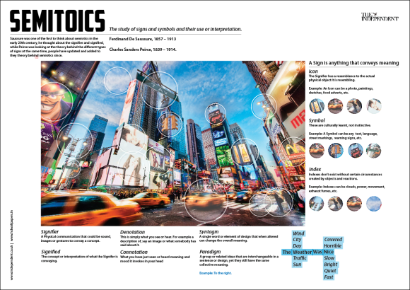
After first initially creating my groups semiotics poster I decide it would be really beneficial to have some people give me feedback on it and they really liked the design there were just a few things that needed to be changed and moved about to make the poster a final outcome.
The photo below shows the feedback that I was given from my teacher and this is the first copy of the design, the things that she pointed out on that I should and needed to improve were as following:
- The history information underneath the title is too long it needs to be broken up and adjusted.
- The different aspects of semiotics need to have a bit more information to help the reader understand semiotics better.
- There could possible be some more images around the large central image.
- I need better examples for the sign’s sections.
From this I adjusted everything to a stage were I thought it a finished product, but even now I have just seen a couple of things that I need to change, so I decided to do my own feedback sheet, proof reading it all and looking for any errors no matter how small they were and here’s what I came up with:
- Move the top right hand logo in line with the body text below?
- I found a couple of spelling and grammar mistakes.
- The bottom section’s bottom lines need to be put in line I can’t rely just on the text box to do that.
- The Example at the bottom needs “Example rather than E.G. to tie in with the rest of the poster better”.
Design Adjustments:
- So basically taking every bit of feedback into account I began adjusting the poster.
- With the new addition of the images on the right hand side I felt there was no need to have the lines coming from each focal point which in turn allowed me to have more without over crowing the image.
- Taking my teacher’s feedback I shortened the top history piece of information and moved the names and dates next to this to make it in line with the rest, this made this section look a lot better and easy on the eye, especially when following the text now, because after all this copy in the photo is a4 not the real size a1 so I need to be critical about my decisions now.
- As a group we were all in yesterday me, James and Luke, now we discussed what poster we should use between mine and James, after all coming to an agreement we decide to use mine because it was different and more appealing I guess, but we didn’t let James work go to waste, because he’s had good information we went ahead and moved he’s information over to mind, this really helped me out in getting this design done because after all it is a group project so all 3 of us should be involved.
- After inserting all of the new text I just needed to adjust were everything was slightly because it all seems to have come out of the grids that I made which wasn’t good so all I had to do was re-line everything to make the final poster design.
Final Design:
 From the Start of this project I had this idea in the back of my mind, but I didn’t think that it would work so I never went ahead with it but I’m so glad I did, it’s just something that I didn’t think a poster on Semiotics could look, I’ve always wanted to do something different, I’m always trying to push myself to do designs that make me happy to be doing them and this one has been my favorite, I have really enjoyed seeing it come together and getting great reviews because of it, getting feedback before the project finishes is something that I will need to do in the future for every project simply because it gives me an insight into what other people see and they can analysis it better than the designer because they havent been working on it and understanding it.


![IMG_0360[1]](https://alexrichardsondesign.wordpress.com/wp-content/uploads/2013/04/img_03601-e1366355048312.jpg?w=460&h=345)