I have decided to have a look at several different types of websites and categorise them either Good or Bad in my opinion and I will mention why I have done this for each website, in doing this I think it will allow me to see better what I personally think is a well layed out website and what I think isn’t, this will help me in the development stage when design mine or searching for one to use.
 Tumblr is a very well-known blog based website simply because it’s free t a degree and it’s highly customizable to create a unquie and personalised blog, My favourite feature of Tumblr is the fact that there’s so many different options to customize. you can choose an already created “theme” or you can create a new one, this website allows the user to edit the script used for their blog page so the possibility to edit and re-create is something that is highly appealing and rewarding.
On a website like this it’s hard not to choose good so I have just because of the fact it’s so customizable, but there are bad point to this website like unattractive blogs and theme’s but this is a personal chose at the end of the day.
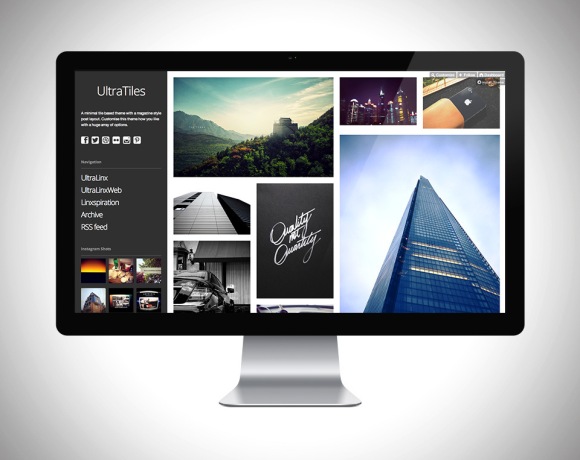 I thought It would be relevant for me to have a look at some different themes to see what type of design I Like, the first is Ultra Tiles, the design really looks appealing to me and it would really work well for an online portfolio I think, this is because we are graphic designers and own work is visual based so for me large and selective images with clean lines and format is highly appeal and modern, also having details to one style is unusual , most seem to have them on either the top of the bottom.
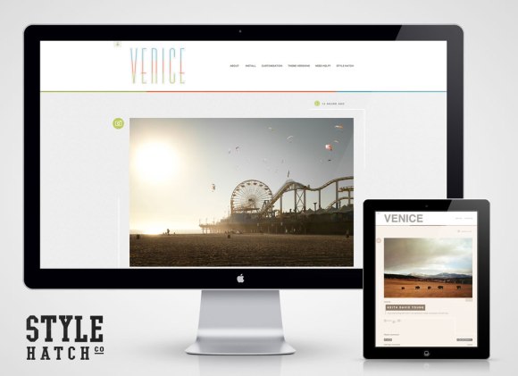 Another chosen theme called Venice designed by Style Hatch, this one features the large image format that I mentioned I liked on the first theme, this one features the usual top section with the pages and details, but the images are a lot larger and possibly in a stacked view, this could be better for my web-based portfolio because it will allow possible employers to see each piece of my design by itself with the details below, this would look a lot cleaner and possibly more professional.
I don’t really see the point talking about what I don’t like on another possible blog theme, I would prefer to talk about ones that I like.
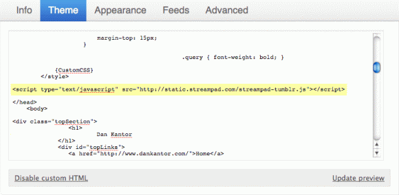
Here’s an example of some Tumblr CSS, script:
 WordPress is what I currently use and overall it’s very easy to use, it does allow the user to customize their blog to a degree but it’s doesn have as much freedom as Tumblr, but this can be a good thing or a bad things, for me it’s a good thing and this is because I don’t know how to write and edit script yet, so I would only end up mucking it all up. I find this so easy to use but for a web-based portfolio I’m not so sure to be honest, but this is only because of the lack of themes and options, It have all of the basics but as designers we are allows looking to make something our own, making it unquie and an expression of ourselves.
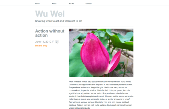 The theme I am currently using is Wu Wei and this is because it is really clean and simple which allows my images, text and work to be unaffected by the theme it’s self, this theme features the large image which I said that I really liked, this theme also allows me to put in text right below the images If I choice, the only problem for me is that this is more of a blog rather than a Web-based Portfolio so I don’t think it would work, but as for a template and inspiration this is highly useful.
So overall WordPress Is a Good website but it’s a bad web-based Portfolio website just because of the fact it’s a blog more than anything.
Next I wanted to have a look at some actual web-based graphic design portfolio’s to see how other designs like their portfolio to look?
http://www.mattherivel.com/index.html
First up was Matt Herivel’s web-based portfolio:
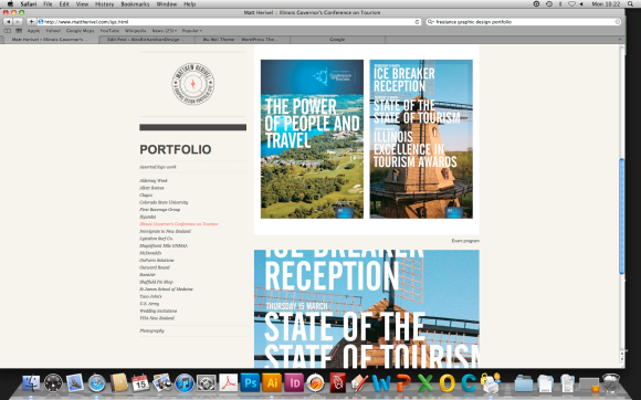
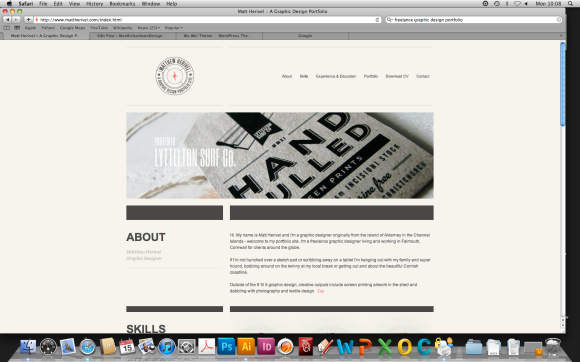 This portfolio is everything and more than I want mine to be like, it has a really appealing, clean and simple layout with the details and the content of the portfolio centered to make I’m guessing the outside negative space drawing the eyes to the centre, straight up the page has a lot of text, it has a short piece about him and a really nice piece of design which specifies he’s skill sets of certain design based programs and requirements.
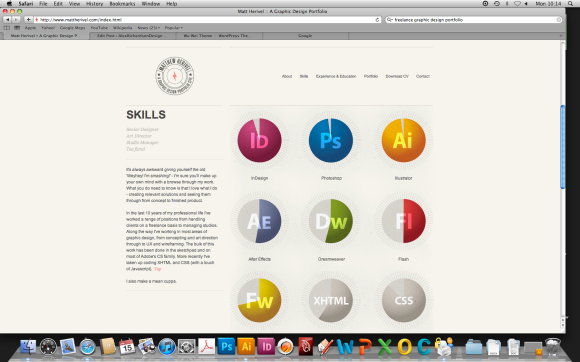 Having something unexpected like this is really a nice surprise, it adds much need colour to the index page of the portfolio and something like this sets your own website apart from others, something that I really liked on the index page was the fact when you scrolled down the top section stayed there and the bottom scrolled, this is a really nice feature and something that you don’t see to often.
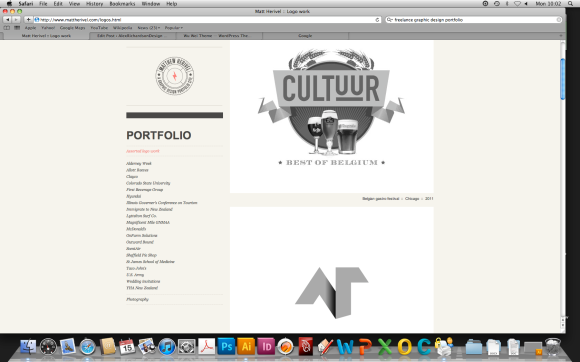
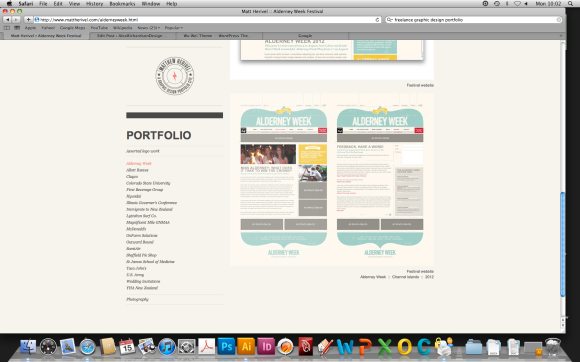
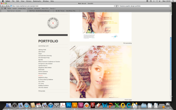
I have next just taken a few screenshots form he’s portfolio pages, these feature large image of he’s won designs and works, these pages feature the same unquie scroll feature as on the index page.
Herivel’s portfolio featured all of he’s design categorized in “project” titled pages on the left hand side, one thing that I really liked which I want to use is that the fact he has some close up screenshots of some of he’s designs to some possible detail which may be hard to see on the full size images, in doing this it shows me that the design is proud of he’s designs and there’s nothing wrong with that at all so I might possibly use this idea.
Overall this web-based portfolio is really good and the best I have seen, it features everything that I think a good design based portfolio needs, it’s clean, simple and function’s well.
The last Site I am looking at is another portfolio but it’s David Airey.
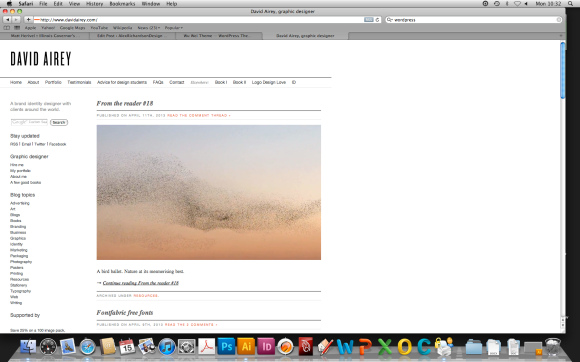
Like the first one the layout is very simple and clean which i really like the only thing straight up is that I don’t like how small the title is, for me a portfolio is advertising your self so you want your name to be rememberable I think and this can either be achieved by having an unique title or a large title, this portfolio is a lot more in-depth than the previous one and I will show how below but first another thing that is bugging me with this site is that it’s all over to one side and I think that there’s so much wasted space, I know that having negative space is normal a good thing but I think in this case it makes the site look unfinished which I don’t like either widen it or centre it!
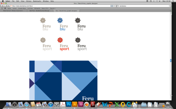
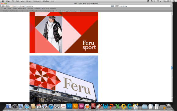

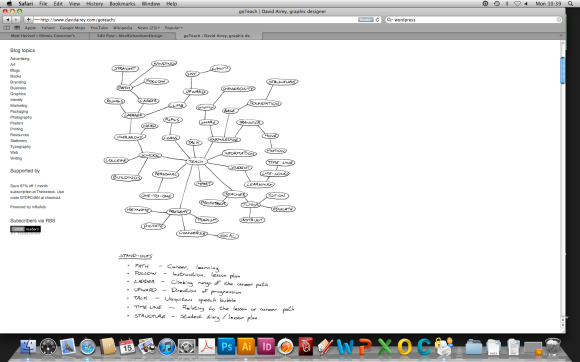
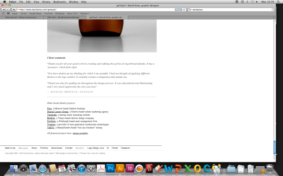 As I wrote above this portfolio features a lot more to each design post, the designer has added nearly every aspect of he’s design process and though, this is a nice feature because it show the client and employers how he works as a design which is important for people to know, but this I think isn’t always necessary but It is a nice feature to have on certain posts that maybe could require it? especially if the designs are completely different from what has been asked because sometimes having this train of thought can really help ell a design.
Overall this is a good and bad webite, if features some really nice things like the in-depth design train and the client comments, but it also has a lot of things that I would change like the overall position of the site, I would either centre it or widen it and the title is unappealing but other than these easy to fix things it’s a clean portfolio that features well.
After having a look at what makes a good web-based portfolio to me I next need to do some more inspirational research and some design sketches to see exactly how I want my portfolio to look whether I design it for this project r it’s something I develop later on…
